Introduction
Making personal finance feel simpler
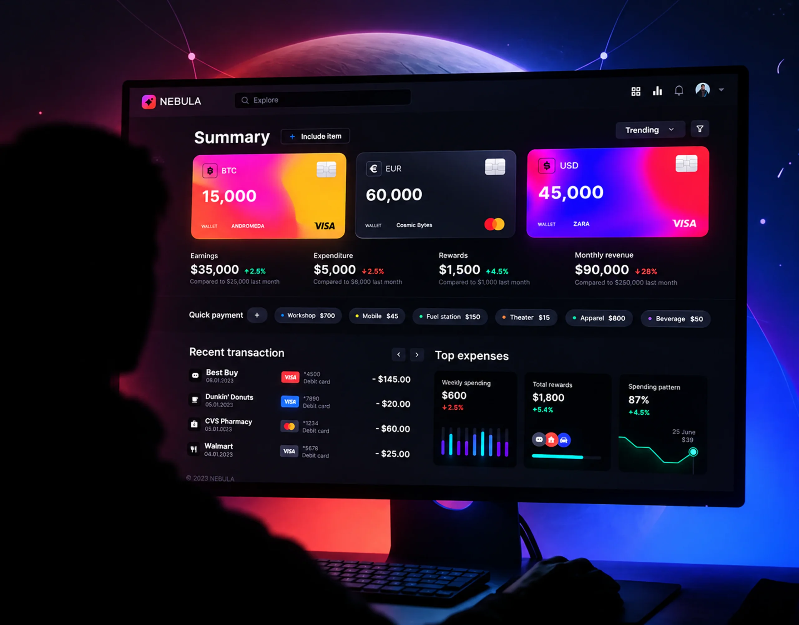
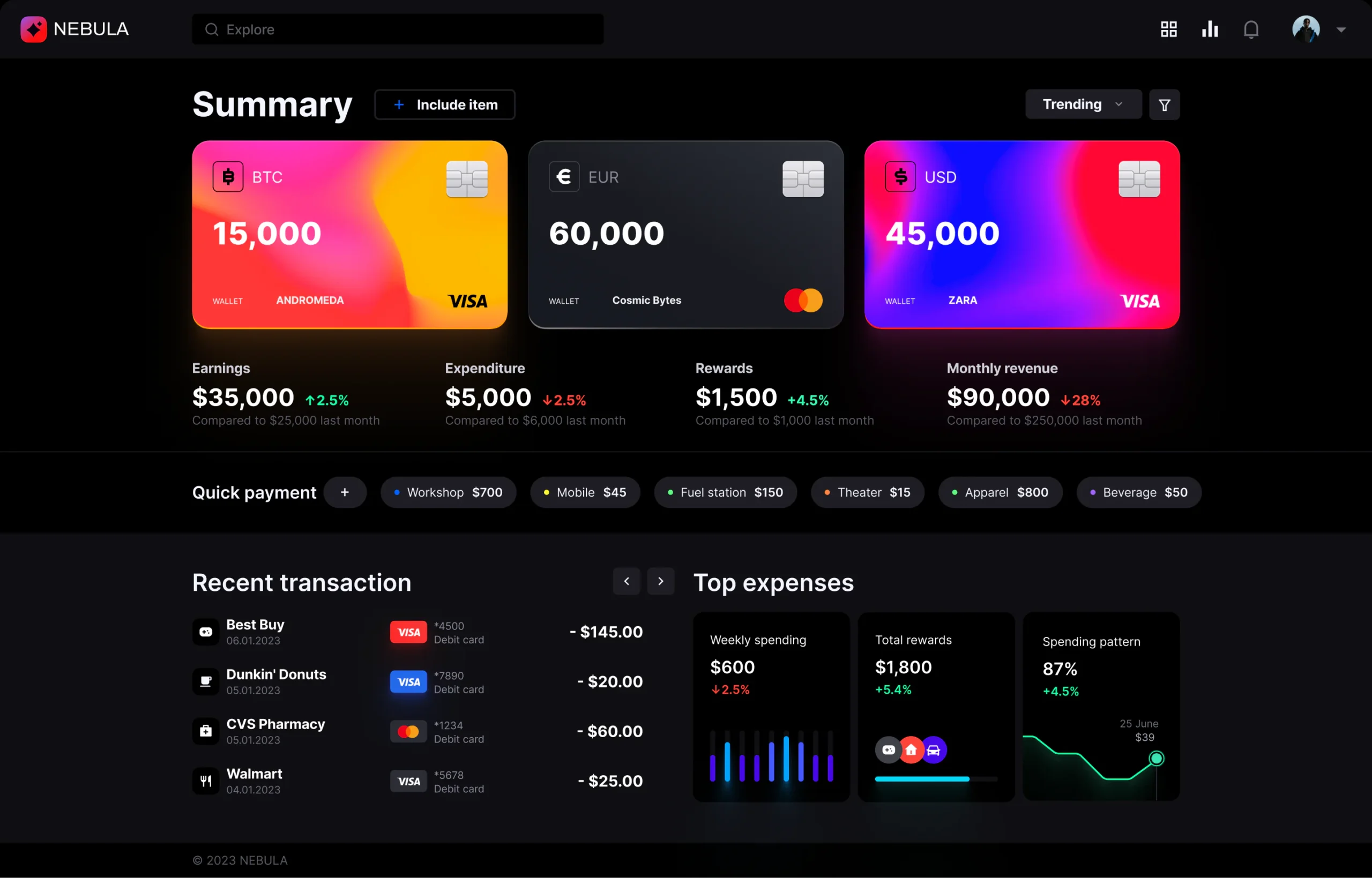
NEBULA is a modern financial platform designed around the everyday needs of digital-first users. The product brings wallets, payments, transactions, rewards, and spending insights into one focused experience.
The goal was to create an interface that feels premium and approachable while making financial information easy to scan and understand.
Challenge
Too much financial information, not enough clarity
Financial products often expose users to balances, transactions, cards, rewards, and analytics across disconnected screens. This makes simple tasks feel unnecessarily complicated.
NEBULA needed a clearer way to organize this information without making the experience feel like a traditional banking application.
The challenge was to balance financial complexity with a simple, visual interface.
Solution
One connected financial workspace
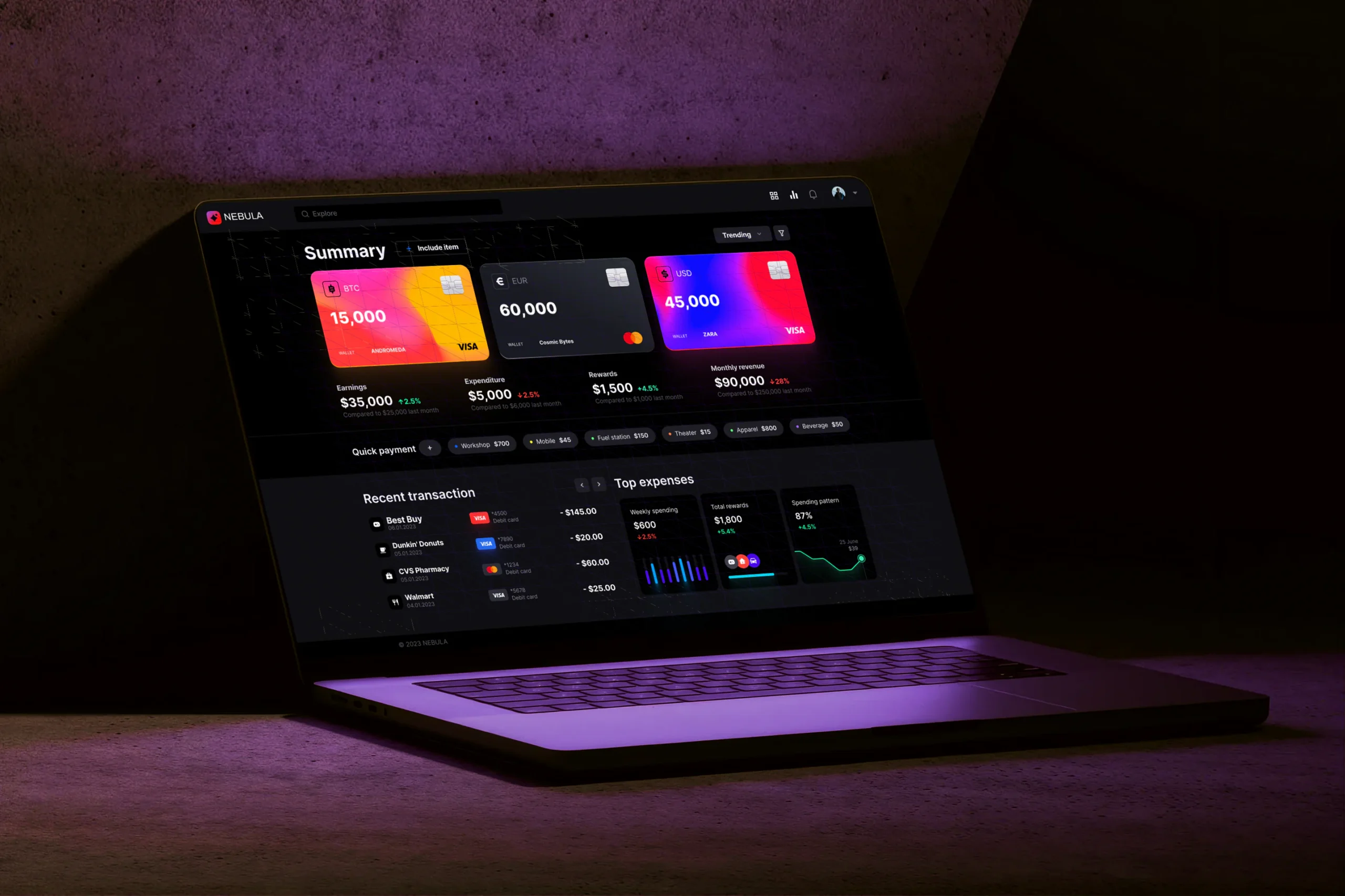
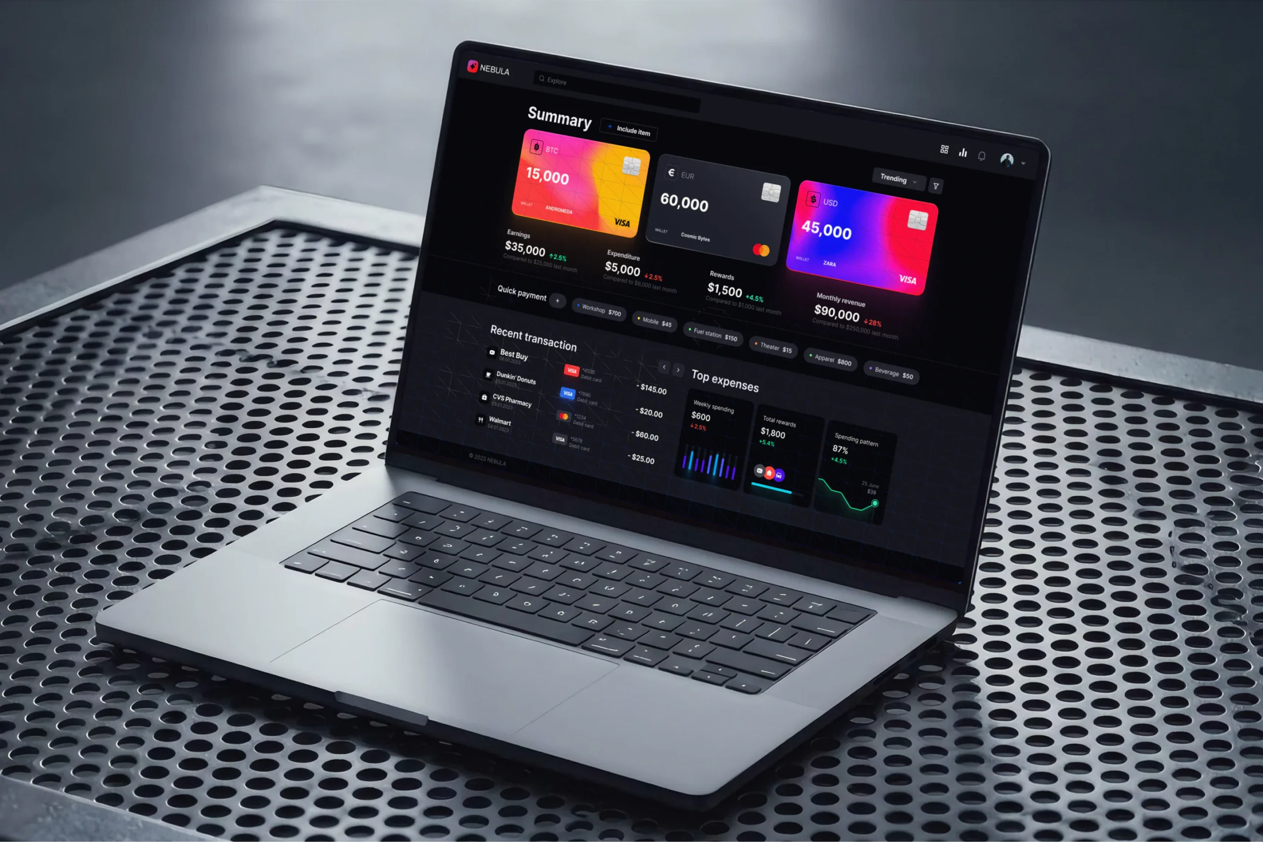
We designed NEBULA around a centralized dashboard where users can quickly understand their financial position and take action.
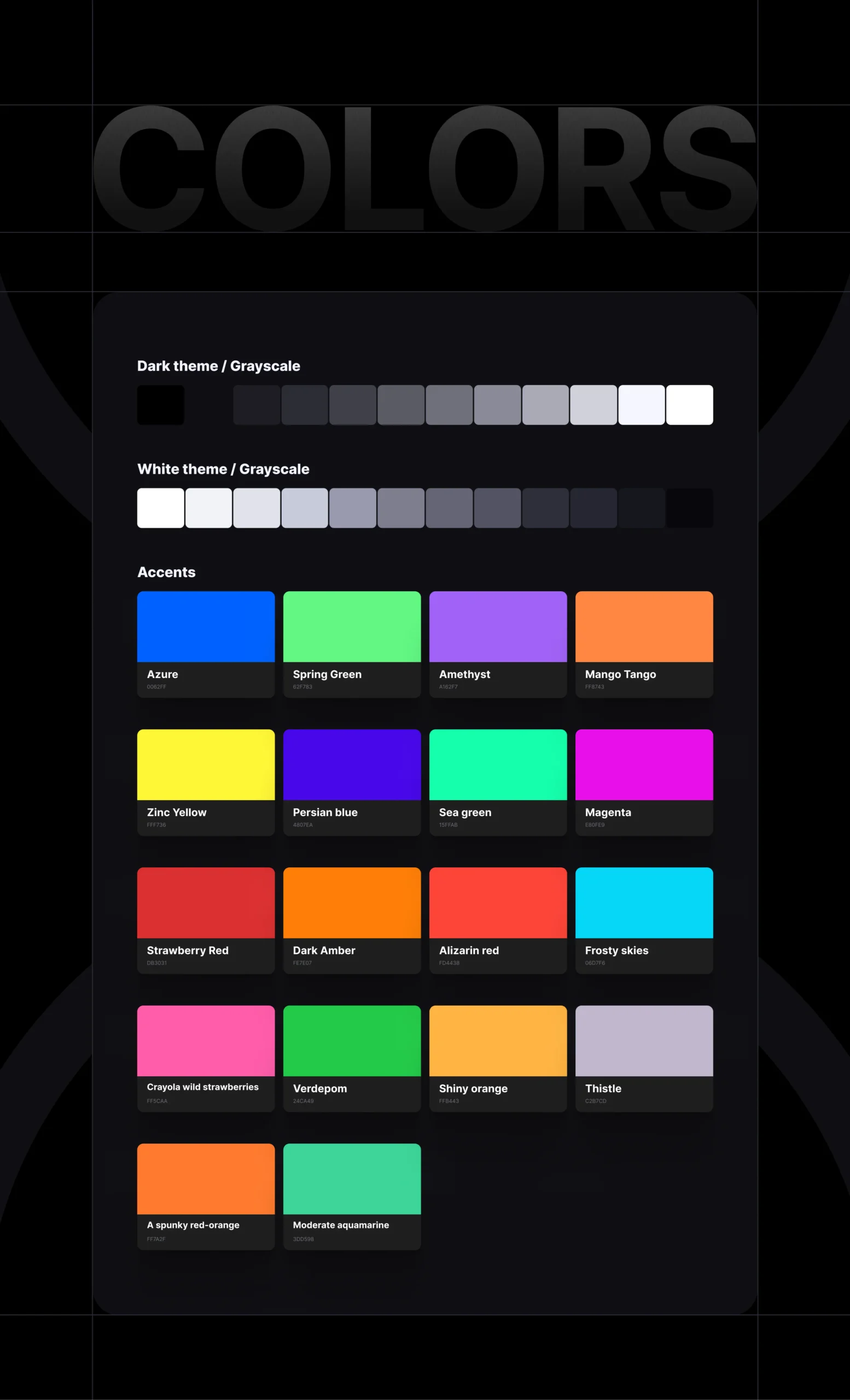
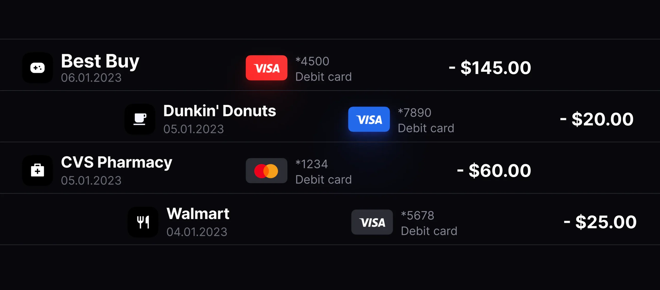
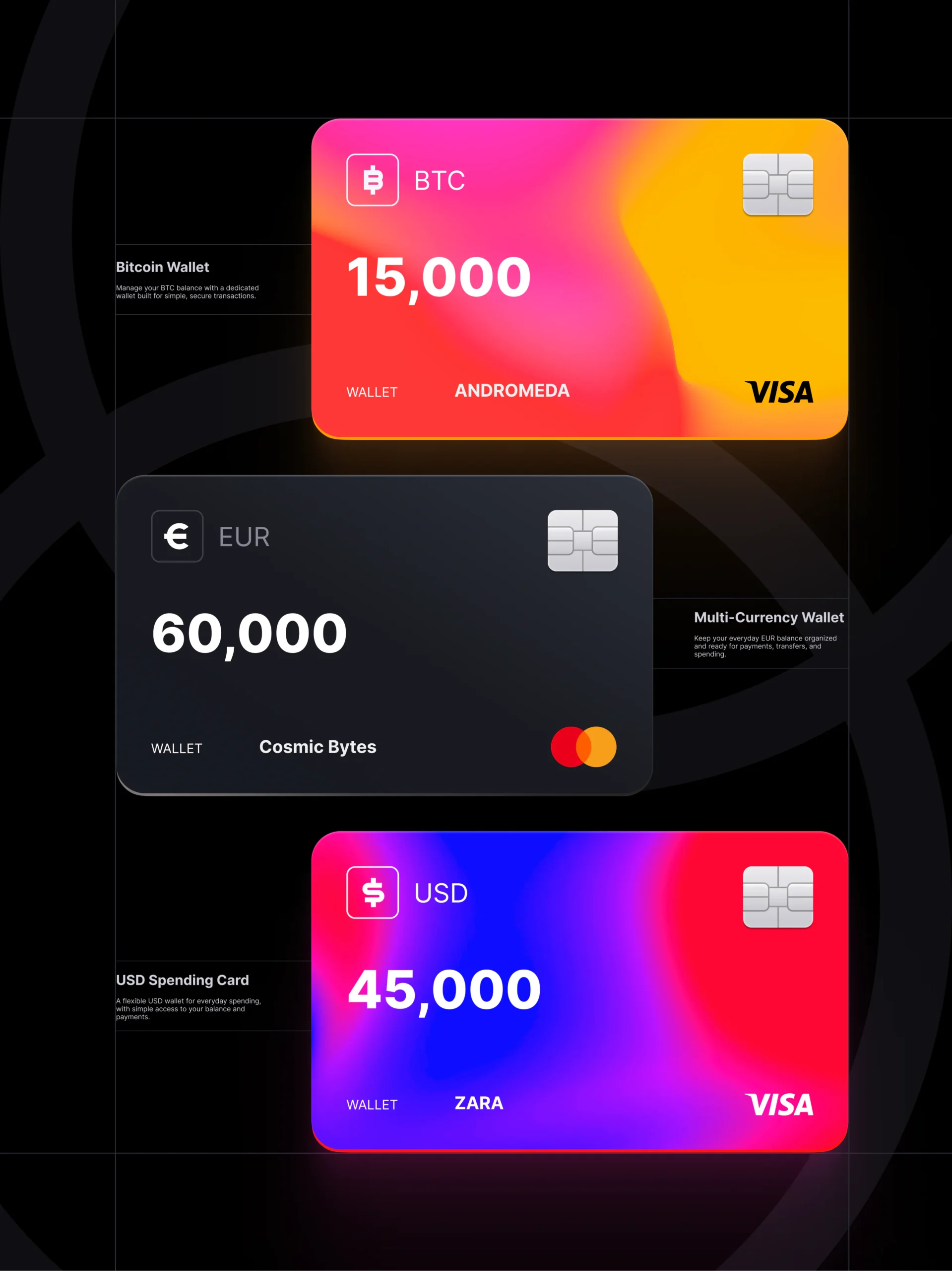
Wallets, payments, transactions, rewards, and spending insights were organized into clear visual groups. A dark interface, vibrant gradients, and focused data visualization created a distinctive identity while keeping important information easy to find.
Process
From financial complexity to a focused experience
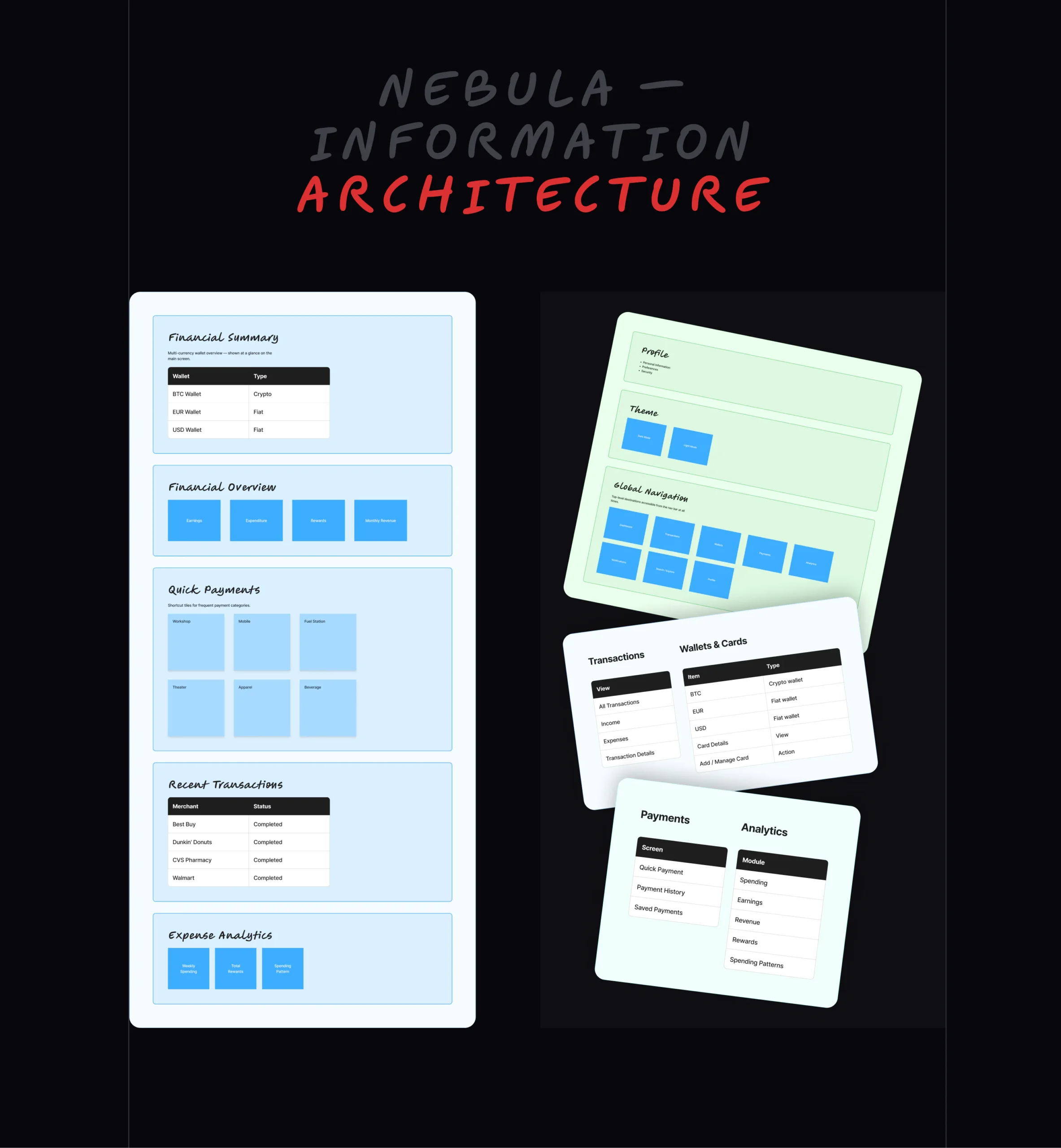
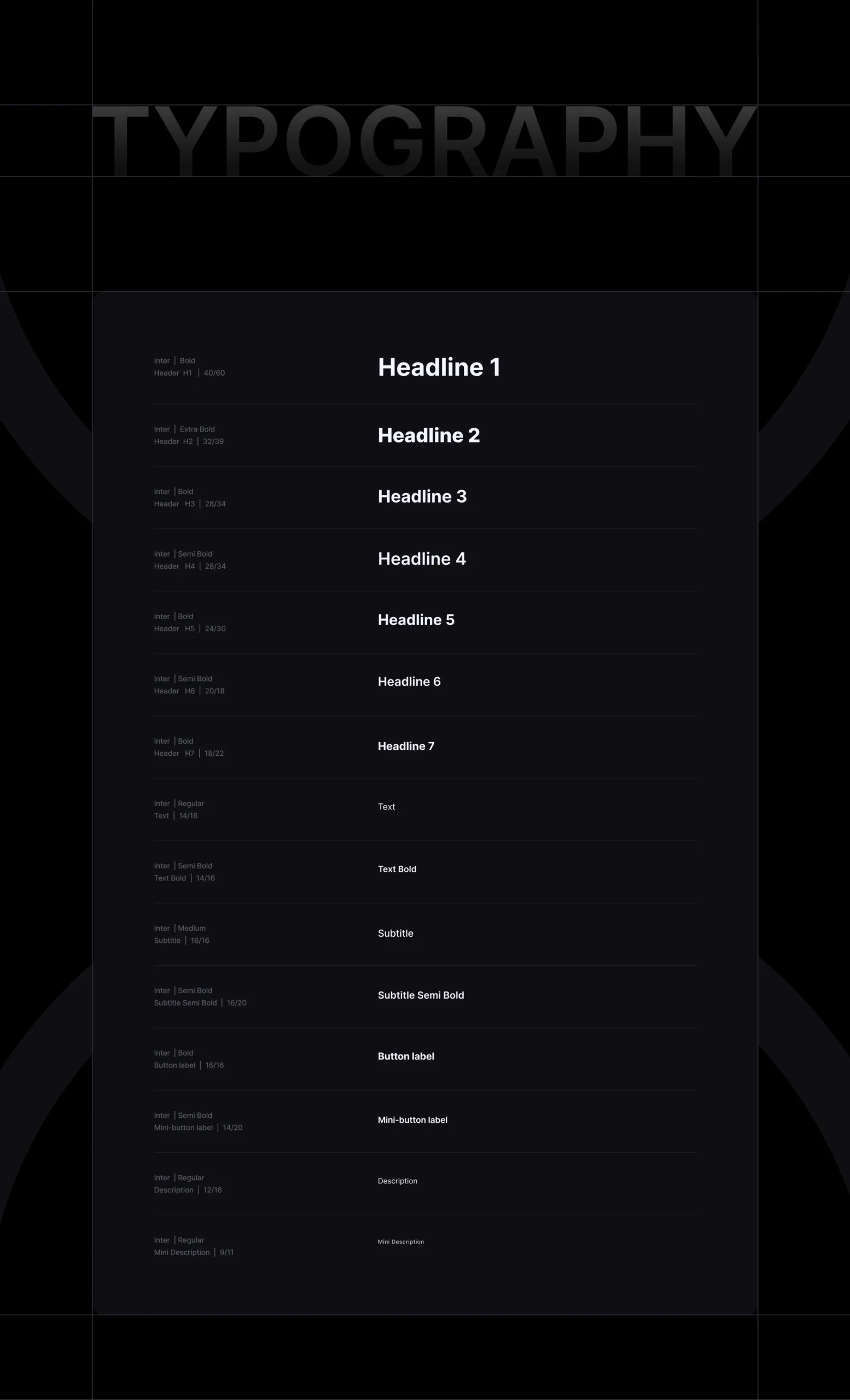
The design process moved from understanding the product structure to defining the visual system and refining the key user flows.
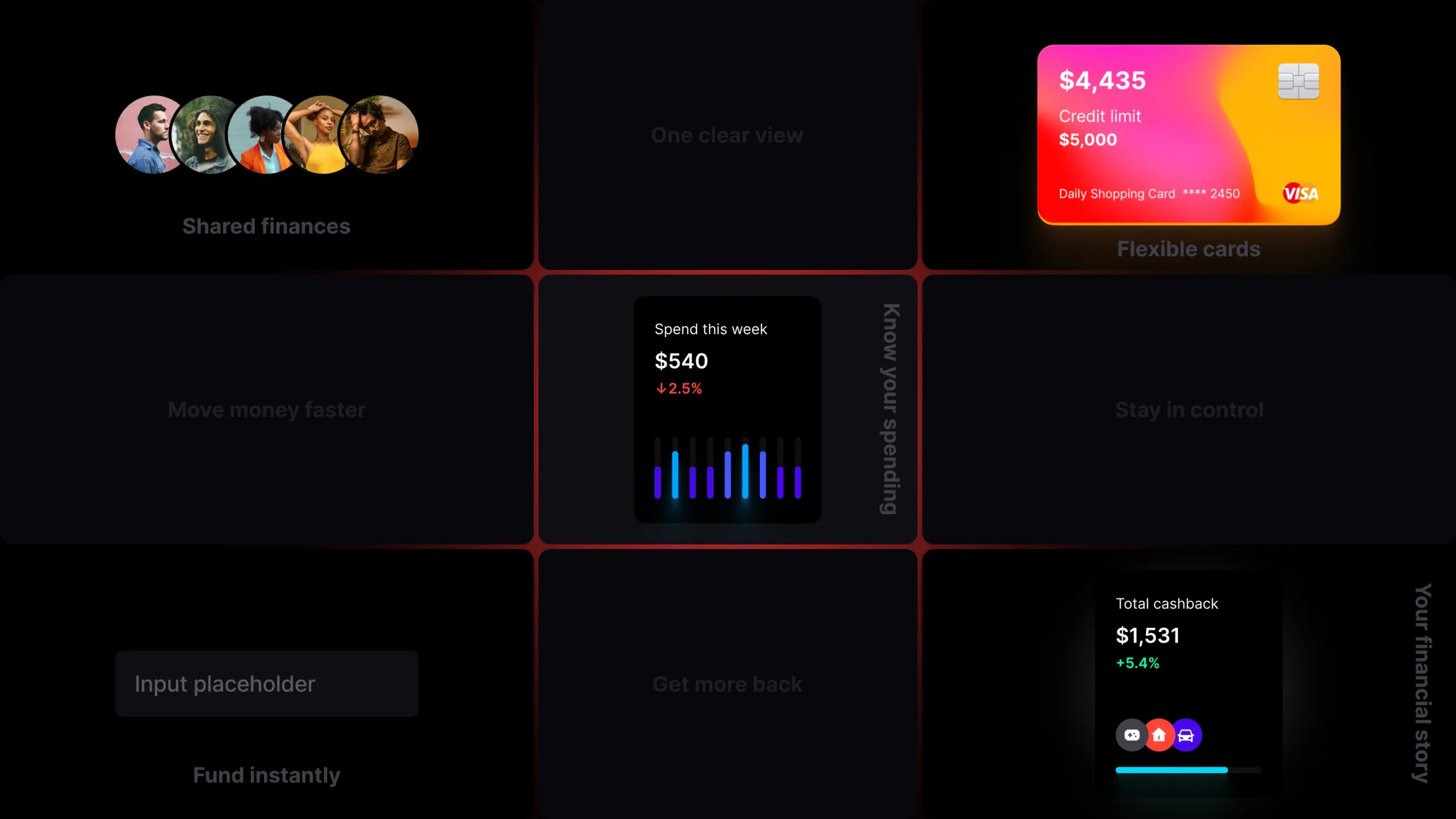
We explored different dashboard structures, card layouts, navigation patterns, and data visualization approaches before building the final interface in Figma.
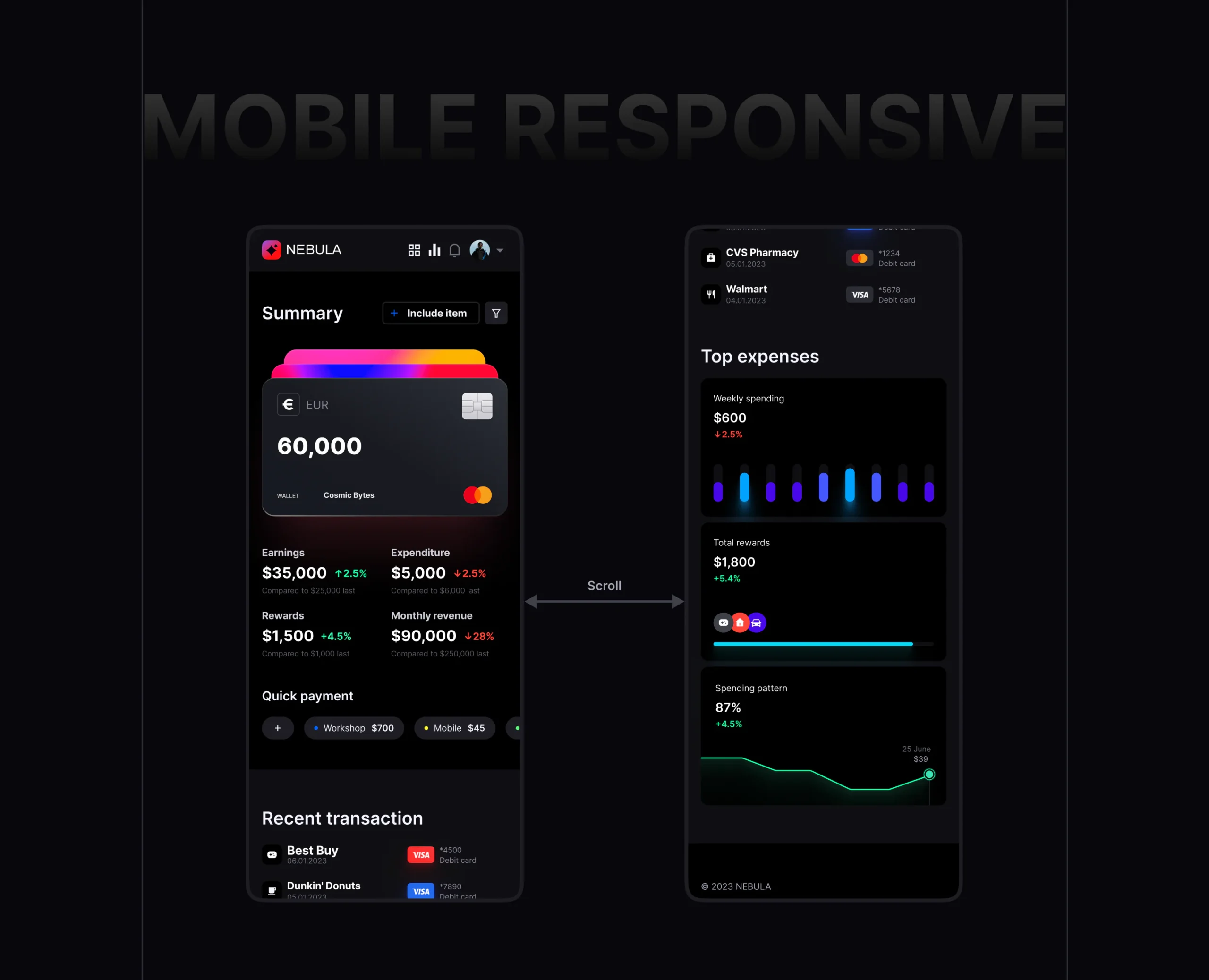
The system was then extended across desktop and mobile experiences to maintain consistency throughout the product.
Research → Information Architecture → Wireframes → Design System → UI Design → Prototyping → Refinement
Research
Designing around real financial behaviors
The research focused on how users interact with digital wallets and financial dashboards, particularly the information they need most frequently.
We identified four core areas:
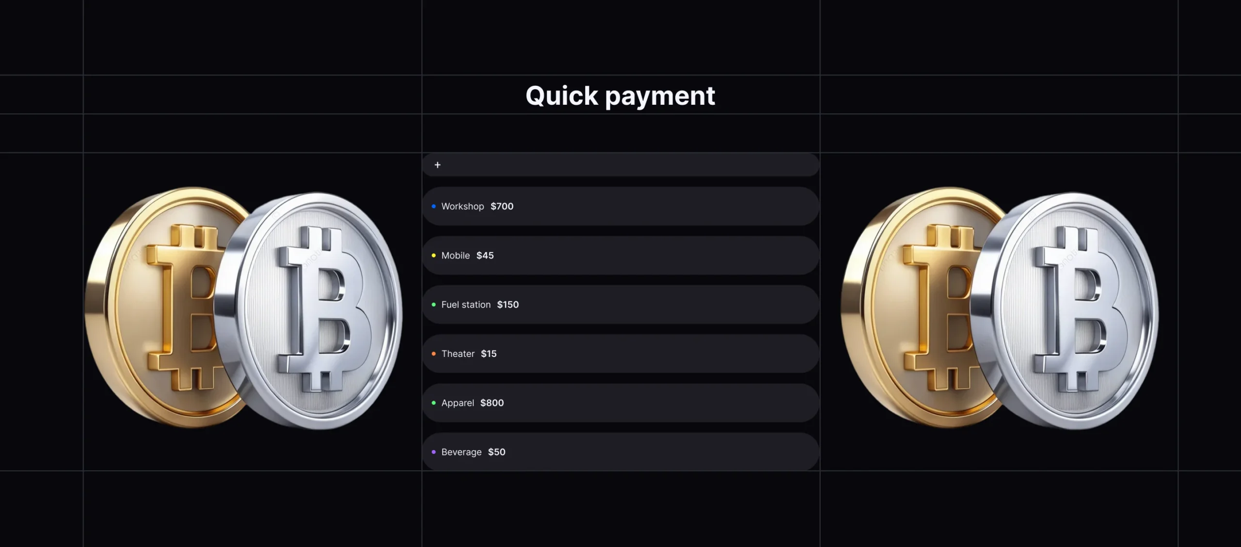
Balance — Quickly understand available funds. Payments — Make common transactions with minimal steps. Activity — Review recent transactions and spending. Insights — Understand patterns, rewards, and financial progress.
These findings helped shape the dashboard hierarchy and determine which information deserved immediate visibility.
Results
A clearer way to understand money
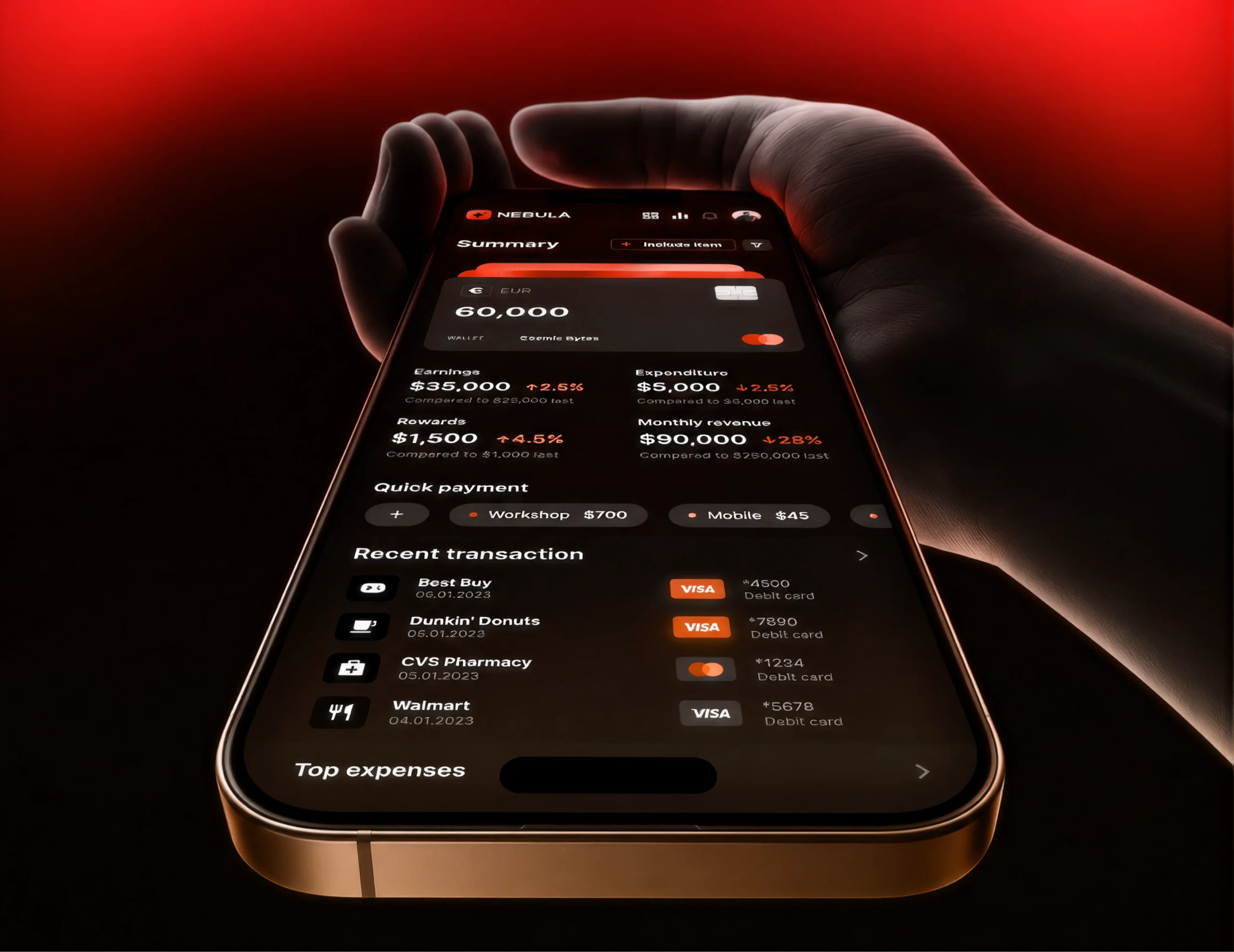
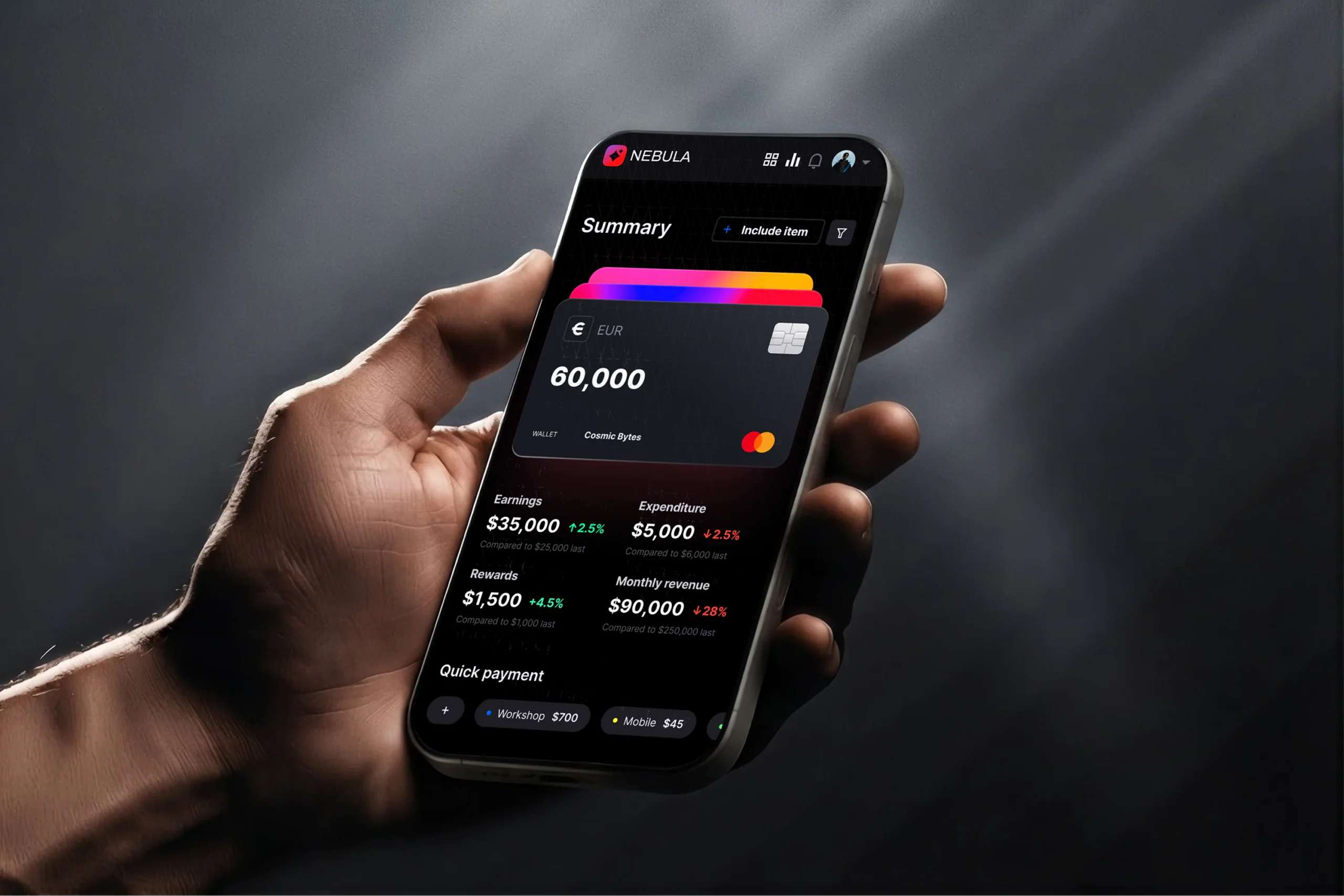
The final NEBULA experience brings essential financial information into a single visual system. Users can move from checking their balance to reviewing transactions, making payments, and understanding spending patterns without losing context.
The resulting interface combines financial dashboards, digital wallets, payment actions, and analytics into a cohesive product experience designed for everyday use.
Key outcomes
Unified financial dashboard Multi-currency wallet experience Simplified payment actions Clear transaction hierarchy Visual spending analytics Consistent responsive design system

Conclusion
Finance, made easier to navigate
NEBULA was designed around a simple idea: financial tools should give users clarity rather than more complexity.
By combining structured information architecture with a strong visual system, the product turns balances, transactions, payments, and insights into an experience that feels clear, modern, and easy to navigate.